ColorSculpt: A Color Grading Tool You Can Touch [Open Source + Free]
By Justin Wetch
GITHUB REPO: github.com/justinwetch/ColorSculpt
TRY IT NOW: colorsculpt.vercel.app
Around 2007, someone on the Houdini forums posted a 3D LUT viewer. A LUT is a look-up table, essentially a mathematical recipe that transforms colors in an image (the thing that gives a movie its "look," that teal-and-orange blockbuster palette or that faded film warmth). This viewer took that recipe and plotted it as a cloud of points in three-dimensional space. Every color became a coordinate. Every color shift became visible as physical movement. The entire logic of a color grade, normally locked inside sliders and curves, was suddenly something you could rotate and inspect from any angle.
I found that thread about four years ago and the idea hit me immediately: what if you could reach in and move the points?
Not adjust sliders. Not tweak curves. Not nudge color wheels and hope the result matches what you're imagining. What if you could literally grab a region of color in 3D space and drag it somewhere else, watching your image transform in real time?
I've been obsessed with this ever since. ColorSculpt is what finally came out the other side.
Color is already 3D. We just pretend it isn't.
Every pixel in an image has a color, and every color lives at a specific coordinate in three-dimensional space. One axis for lightness, one for green-to-red, one for blue-to-yellow. Most color tools hide this. They give you flat interfaces, sliders and curves and wheels, that represent projections of a fundamentally 3D relationship. You're working with shadows of the real thing.
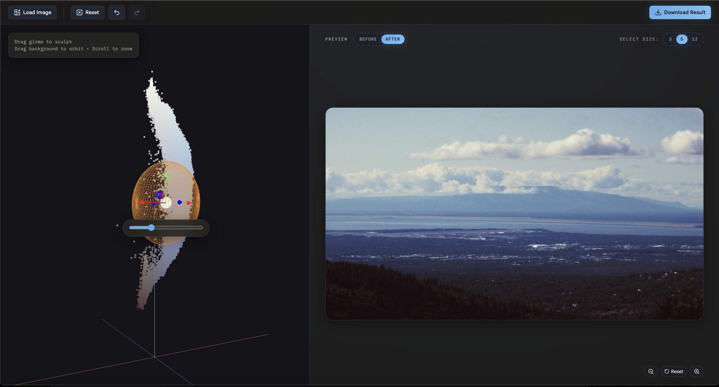
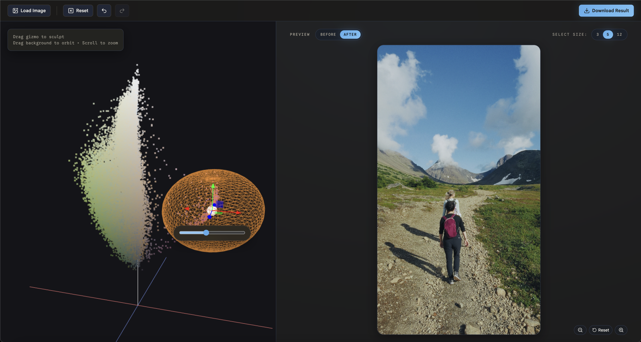
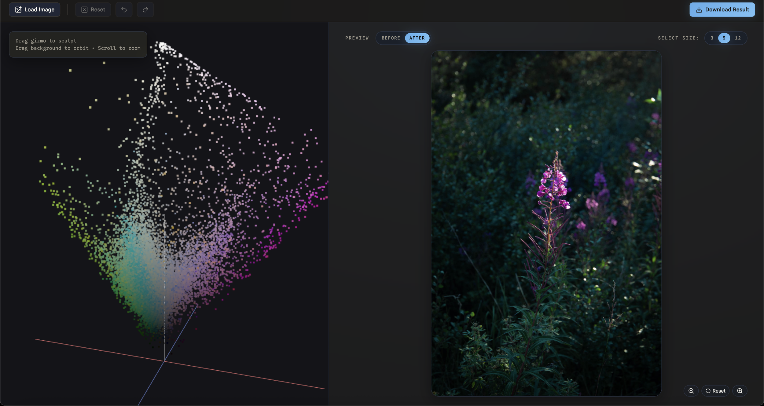
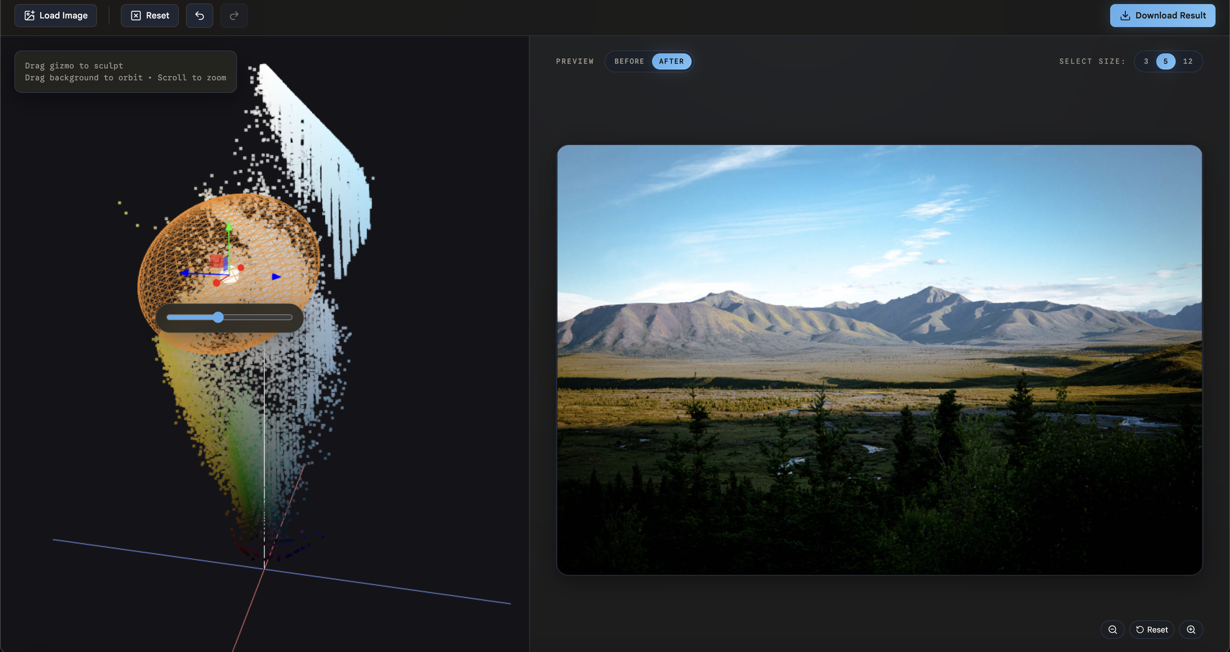
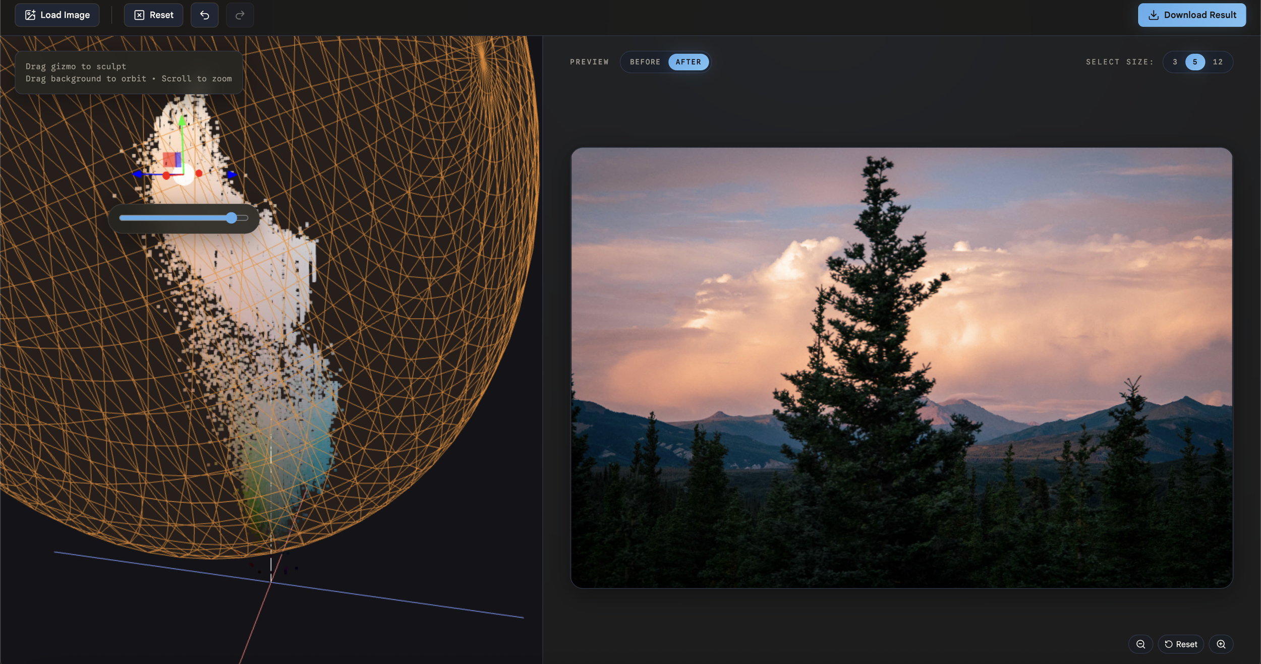
ColorSculpt makes the 3D space literal. Upload an image and it appears as a point cloud, each sample plotted at its actual position in color space. The image's entire palette becomes a physical shape you can orbit around, zoom into, and inspect. Dense clusters show you where most of the image's colors live. Sparse tails show you the outliers.
Then you sculpt it.
Click on a region of the cloud (either by sampling from the image or clicking directly in the 3D viewport). A brush appears around your selection. Grab the handle and drag. Every pixel within that brush's radius shifts in the direction you pulled it, with smooth falloff so the edit blends naturally into surrounding colors. You're not adjusting a parameter. You're physically reshaping the color of your image.
Want warmer highlights? Grab the bright cluster and pull it toward amber. Want to desaturate the greens without touching anything else? Find the green region in 3D space and push it toward the neutral axis. The mental model is immediate: see the color, grab the color, move the color.
Why the color space matters
A quick note for the curious. ColorSculpt works in a color space called OKLAB, which is designed so that equal distances correspond to equal perceived differences. This sounds academic but it's what makes the tool feel right. If you drag a brush the same distance in two different parts of the space, both edits look proportionally similar to your eye. In a naive color space, the same drag might produce a dramatic shift in one region and a barely perceptible one in another. Perceptual uniformity is what lets the direct manipulation metaphor be honest. Without it, the tool would lie to you about what your edits are doing.
How sculpting works
Each edit is simple: a center point, a radius, and a direction to move. When you drag the handle, every pixel whose color falls within the brush radius gets shifted, with a smooth curve that applies the full shift at the center and fades to zero at the edge (so there are no hard boundaries or visible seams). Stack multiple edits and they accumulate into a complex color transformation, one you built entirely by pointing and dragging.
The edit history is a sequence of spatial transformations. Undo, redo, reset. And because the whole thing is just a deformation field, what you've sculpted can be applied to other images or exported as a LUT for use in traditional tools.
Design decisions
A few choices worth explaining.
Sampling from both worlds. You can position the brush by clicking on the 2D image preview (which maps that pixel's color to its 3D coordinate) or by clicking directly on the point cloud in the viewport. Both paths lead to the same place. The image sampling averages a small region around your click (configurable to 3, 5, or 12 pixels) so you're not at the mercy of individual pixel noise.
Handles over freeform drag. Early on I had to decide between letting users drag freely in 3D and using a gizmo with explicit axis handles. Freeform feels more intuitive at first, but it's harder to control because you can't constrain movement to a single direction. When you're doing color work, the difference between "shift toward warm" and "shift toward warm and also accidentally more saturated" matters enormously. The gizmo gives you that precision.
Adaptive brush shape. The brush isn't a fixed sphere. It analyzes the colors near your selection and stretches to match their distribution. If you're selecting skin tones, which cluster in a specific elongated region of color space, the brush stretches to fit that shape rather than capturing unrelated colors on the edges. I tried a more aggressive approach first that conformed the brush tightly to the local cloud structure, but it looked noisy and unstable. The current approach preserves the intelligence while keeping things visually clean and controllable.
Before/After. The preview panel shows your edited image with a toggle to compare against the original. Zoom and pan work in the preview so you can inspect fine detail.
Building it
I've tried to build this tool multiple times over the past few years. Each attempt would get partway through the 3D rendering or the color math pipeline and stall out on the accumulated complexity of getting everything working together.
I try to stay current with the latest AI coding tools because the ceiling keeps moving and I want to know where it is. OpenAI recently released Codex, a dedicated coding agent app, and ColorSculpt was a good stress test: a real application with interconnected systems, not a toy. It handled the sustained multi-file work well.
But I want to be clear about what that means. Good software comes from back-and-forth: trying one brush visualization, realizing it looked bad in practice, pivoting to something better. Choosing handle-based manipulation over freeform drag. Iterating on point cloud density until the representation felt right without killing performance. Those are design decisions, not code generation tasks. The color science knowledge, the interaction design instincts, the understanding of what makes direct manipulation feel honest, none of that came from an AI agent. I know where these tools help and where they don't.
An old idea, new tools
The Houdini forum post was from 2007. Visualizing color transformations in 3D has been around for decades. What's new is that building a complete, interactive, real-time tool around that concept used to require months of specialized work. The thinking hasn't changed. The velocity has.
I keep coming back to the same realization across projects: the best tools don't replace the domain knowledge. They remove the friction between having an idea and seeing it exist. I've been thinking about ColorSculpt for four years. Now it's shipping instead of sitting in my head for another four.
It's open source and free. Try it at colorsculpt.vercel.app, and the code is on GitHub.